Have you ever brought home a piece of furniture-in-a-box, and felt undue stress while trying to make sense of the directions to assemble it? ... Apparently you're not alone! A recent analysis studied ~50,000 tweets about IKEA furniture, and determined whether the people posting the tweets were frustrated. They then aggregated the results by country, and plotted the results on the following world map:
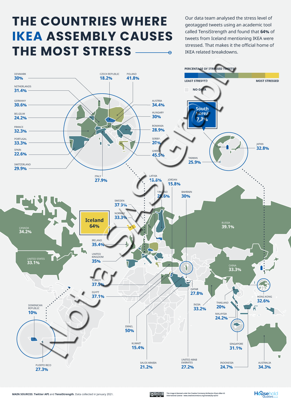
The map grabbed my attention, and the topic seemed interesting ... but I wasn't able to conclude much about the results of the study by looking at their complex infographic. It was difficult to distinguish the colors, and there didn't really seem to be any interesting geospatial trends in the data (therefore why plot this data on a map?). And while it is often useful to label the countries in a map, all these labels, lines, and exploded-zoomed regions, made their map much more complex than it needed to be. (Perhaps this infographic was created in a way to intentionally make the readers stressed/frustrated, to help them relate to the data topic? LOL!)
After studying their data values a bit, I concluded that what I mainly wanted to do was compare the values of the countries. And below is a simple bar chart I created to do just that. Reading the bar chart is much easier/quicker than trying to make sense of the map infographic (above). What can you glean from the bar chart?
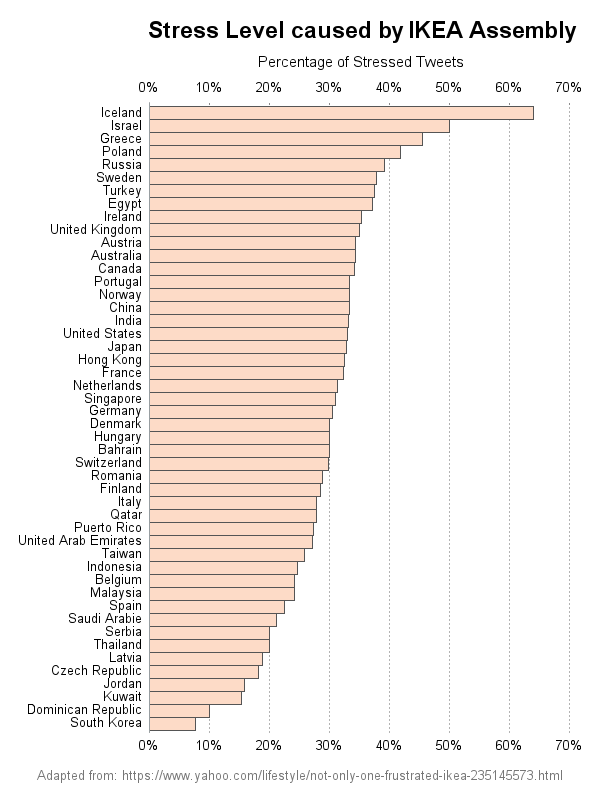
I sorted the bars by descending order, so it's easy to see which countries had highest and lowest values, and how the values varied. I added subtle reference lines so it's easy to see whether the bars were higher or lower than certain values along the axis. And I placed an extra response axis at the top of the chart, so you don't have to scroll to the bottom to see the values.
According to this bar chart, Iceland has the most frustration with IKEA directions, and South Korea has the least - evidently Koreans are very patient! And, surprisingly, Sweden (where IKEA originated) is the 6th most frustrated!
If you're wondering how to create such a chart with SAS software, here is the code I used. (Note that I could have used the simple refticks= option to get the extra xaxis along the top, but I wanted to customize several options and I therefore went with overlaying a second plot.)
proc sgplot data=world_data noborder noautolegend;
hbarparm category=country_name response=percent_stressed /
barwidth=1.0 fillattrs=(color=cxfddbc7) outlineattrs=(color=gray55);
yaxis display=(nolabel noticks) fitpolicy=none offsetmin=.018 offsetmax=.015;
xaxis display=(nolabel noticks noline) values=(0 to .70 by .10)
grid gridattrs=(pattern=dot color=gray66);
/* second, invisible plot, to get a second xaxis along the top */
scatter x=percent_stressed y=country_name / x2axis tip=none
markerattrs=(size=0px color=white symbol=circle) transparency=1.0;
x2axis display=(noline noticks) values=(0 to .70 by .10);
run;
What's the most stressful/frustrating thing you've ever assembled? Feel free to share in the comments!


6 Comments
Hi Robert,
Is there a link to the complete SAS code? Thanks
No - not this time.
Oh my! I can understand why the infographic grabbed your attention. Eye-dazzlingly shocking!!! A geographic map in a circle which gives the impression it is a type of pie chart!!! Certainly like your bar chart to get a comparative understanding of the data.
Not sure if I can say I've been stressed assembling something but I've had some frustrating moments packing suitcases when traveling and these days I kinda miss it! 😉
Hahaha! - Perhaps I have "subliminal pie bias"! 🙂
Is there a stress level for a robot ...
IKEA-Building Robot Conquers Touchy-Feely Challenge
https://www.scientificamerican.com/article/ikea-building-robot-conquers-touchy-feely-challenge2/
Hmm ... perhaps the Koreans are using robots to assemble their IKEA furniture!